
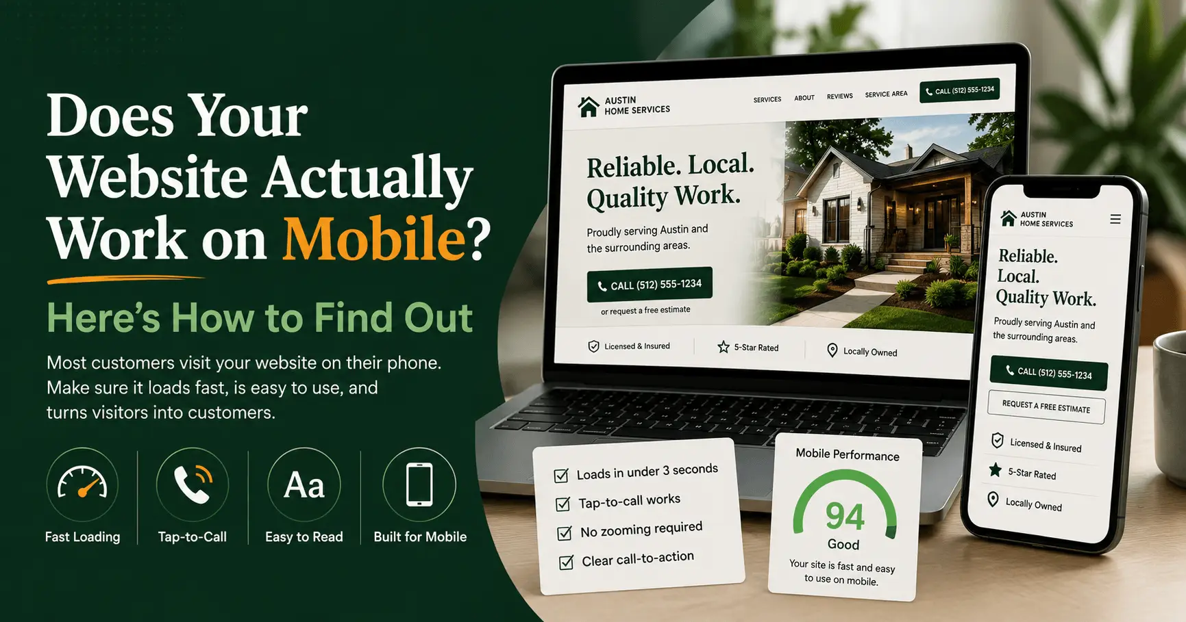
Pull out your phone right now and open your own website. Go ahead. Do you have to pinch and zoom just to read your own phone number? Does a button sit halfway off the edge of the screen? Does the whole thing hang on a blank white page for a few seconds before anything shows up? If any of that sounds familiar, you’ve already found the problem. Most of the people looking for a business like yours are searching on a phone, and if your site fights them, they don’t call. They tap the next result.
Here’s the short version. Your website works on mobile if it loads in under three seconds, reads clearly without zooming, and lets someone tap your phone number or a “book now” button on the first try. The fastest way to find out is to open your site on your own phone and try to actually use it, then run it through Google’s free PageSpeed Insights for a second opinion. Roughly 60% of all web traffic now comes from mobile devices, according to StatCounter, so for a local business, the mobile version of your site is the real version. The desktop version is the afterthought.
Why does it matter if your website works on mobile?
It matters because most of your customers never see your desktop site. Around 60% of web traffic is mobile, per StatCounter, and since July 2024 Google has indexed and ranked every website based on its mobile version instead of its desktop version. If your mobile site is slow or clumsy, your search rankings and your phone calls both take the hit.
That second part catches a lot of owners off guard. It’s called mobile-first indexing, and Google finished rolling it out to 100% of sites in mid-2024. In plain English, the version of your site Google actually judges is the one on a phone. You could have a beautiful desktop layout, but if the mobile version loads slowly, hides half the content, or breaks the navigation, that’s the version Google grades you on. It’s a big reason a site can quietly slide down the results without the owner ever touching it. For the full picture of what a local business site needs to pull its weight, we walk through it in our complete guide to small business website design.
And rankings are only half of it. A phone is where the decision gets made. Someone searches, taps a result, and decides in a couple of seconds whether your business looks legit and worth calling. Mobile-friendliness feeds straight into your local search visibility too, because Google isn’t going to push a frustrating mobile experience to the top of a “near me” search when a smoother competitor is sitting right there. We’ve been in the trades ourselves, and we know a contractor doesn’t have time to babysit a website. But this is the one thing that decides whether the phone rings.
How do you test if your website actually works on mobile?
The most honest test is the simplest one: open your site on your own phone and try to do what a customer would do. Call the business, find your hours, book an appointment. If any step makes you sigh, it will make them leave. Then back that up with Google’s free PageSpeed Insights for the technical read. Here’s the full process, start to finish.
- Use your own phone like a customer would. Pull up your site on your phone, not your laptop. Try to tap your phone number. Try to find your address and hours. Try to fill out your contact form with your thumbs. Anything that takes more than one attempt is a leak, and every leak is a lost call.
- Run it through Google PageSpeed Insights. Go to pagespeed.web.dev, paste in your URL, and read the mobile score. It grades real-world speed and flags exactly what’s slowing you down, usually oversized images or bloated code. Aim to keep your largest content loading in under 2.5 seconds, which is Google’s threshold for a good experience.
- Borrow a few different phones. Your site might look fine on your newer iPhone and fall apart on an older Android. Hand your phone to an employee or a family member and watch them use it without help. Where do they hesitate? Where do they zoom? Where do they give up?
- Check your Core Web Vitals in Search Console. If you have Google Search Console set up, the Core Web Vitals report shows how your real visitors experience the site on mobile over time. It’s the closest thing you’ll get to a report card from actual customers instead of a lab test.
- Test on a real network, not just office wifi. Turn off wifi and load your site on cell data. That fast load time on your office connection isn’t what a customer standing in a parking lot is getting, and cell data is where most of your traffic actually lives.
One note if you go looking for the old Google Mobile-Friendly Test tool: it’s gone. Google retired that standalone tool and the Search Console mobile usability report back in December 2023, and now points people to PageSpeed Insights and Lighthouse instead. So if an old blog post tells you to run the “Mobile-Friendly Test,” that advice is out of date. Use the steps above.
What does a mobile-friendly website actually look like?
A mobile-friendly website is one a person can read, navigate, and act on with a single thumb, without pinching, zooming, or hunting around. In practice that means text large enough to read at arm’s length, buttons big enough to tap without missing, a layout that fits the screen with no sideways scrolling, and a load time fast enough that nobody gives up waiting.
Google’s own page experience guidance points to a few concrete things: tap targets around 48 pixels so fingers hit them cleanly, body text around 16 pixels so nobody has to squint, and a proper viewport setting so the page sizes itself to the phone. Those sound technical, but the test is simple. Can your customer do the thing they came to do, fast, with a thumb? If yes, you’re in good shape. If they’re fighting the screen, you’re not.
For a local business, one button matters more than all the rest: tap-to-call. A huge share of mobile visitors show up ready to act, and plenty of them come straight from the Google Maps 3-Pack after a “near me” search. If your phone number isn’t a big, tappable button near the top of the page, you’re asking a motivated customer to copy it, paste it, and dial by hand. Most won’t bother. They’ll just call the business that made it easy.
What are the most common mobile problems on small business sites?
The most common mobile problems we see aren’t dramatic. They’re small friction points that stack up: slow load times, tiny tap targets, text that forces zooming, pop-ups that swallow the whole screen, and phone numbers that aren’t clickable. Each one on its own seems minor. Put together, they quietly hand customers to a competitor.
When we audit a local business site, the same handful of issues show up again and again:
- Slow load on cell data. Big, uncompressed images are the usual culprit. Google’s research found that as a mobile page’s load time goes from one second to three, the odds of the visitor bouncing jump by 32%. Push past three seconds and Google’s data shows more than half of mobile visitors are already gone.
- Buttons and links too close together. On desktop, a mouse is precise. A thumb isn’t. Cramped menus lead to mis-taps, and mis-taps lead to a frustrated visitor who bails.
- Text that needs zooming. If a customer has to spread two fingers just to read your list of services, you’ve already lost some of them before they get to the good part.
- Forms that are painful on a phone. Long forms with tiny fields are annoying on a laptop. On a phone, they’re a conversion killer. Keep it short: name, number, and what they need.
- Intrusive pop-ups. A newsletter box that covers the whole screen the second someone lands, with a close button too small to hit, is one of the fastest ways to lose a visitor who was ready to call.
If your site has a few of these, it’s not just an annoyance. It’s often the real reason a site with steady traffic still isn’t producing calls, a pattern we dig into in why your website isn’t bringing in customers. The traffic is there. The mobile experience is what’s letting it slip away.
Do you need a new website, or can you just fix the mobile issues?
It depends on how your site was built. If your site sits on a modern, responsive foundation and the problems are things like oversized images, a missing tap-to-call button, or on-screen clutter, those are fixes, not a rebuild. But if your site was built years ago on a non-responsive template that was never designed for phones, no amount of patching fully solves it. That’s when a rebuild actually pays off.
Here’s a quick way to tell which camp you’re in.
| Situation | Usually a fix | Usually a rebuild |
| Site loads slowly because of oversized images | Yes | |
| Phone number isn’t tappable or is missing | Yes | |
| Layout fits the screen but has clutter or pop-ups | Yes | |
| Text and buttons resize but need tuning | Yes | |
| Built before 2016 on a fixed-width template | Yes | |
| You zoom and scroll sideways on every page | Yes | |
| Separate “m-dot” mobile site that’s out of date | Yes | |
| Platform can’t support responsive design | Yes |
The honest answer for a lot of owners is that the fixes are cheaper and faster than you’d expect. We’ve seen plenty of sites go from failing to solid with a day of work, not a full teardown. If you are weighing a rebuild, it helps to know what one actually runs, which we break down in how much a small business website costs. A working mobile site doesn’t have to be expensive. It just has to work.
What this looks like for a real local business
Picture a landscaping company with a decent-looking site built five years ago. On a desktop, it’s fine. But 70% of their traffic comes from phones, and on a phone the hero image takes six seconds to load, the “Request a Quote” button sits three screens down, and the phone number is plain text you can’t tap. Someone searches “landscaping near me” while standing in their yard, lands on the site, waits, gives up, and taps the next result.
Nothing about that business is broken. The crew is good, the pricing is fair, the reviews are strong. But the mobile experience is quietly leaking jobs every single day, and the owner has no idea, because on their own laptop everything looks great. That’s the trap. The people deciding whether to call you are almost never looking at the version of the site you’re looking at. Compress that hero image, put a tap-to-call button up top, and move the quote button above the fold, and that same traffic starts turning into real calls, without spending a dime on ads.
Common Questions About Mobile-Friendly Websites
How do I check if my website is mobile-friendly?
Open it on your own phone and try to use it the way a customer would, then run the URL through Google’s free PageSpeed Insights at pagespeed.web.dev for a technical read. Together those two checks tell you almost everything: whether it’s fast enough, readable, and easy to act on. Google retired its old Mobile-Friendly Test tool in December 2023, so PageSpeed Insights is the go-to now.
What makes a website not mobile-friendly?
The usual causes are slow load times from oversized images, text too small to read without zooming, buttons packed too close to tap accurately, layouts that force sideways scrolling, and phone numbers that aren’t clickable. An older site built on a fixed-width template that predates responsive design is the most common root cause of all of them.
Does mobile-friendliness affect my Google ranking?
Yes, and more than most owners realize. Since July 2024, Google indexes and ranks every site based on its mobile version through what’s called mobile-first indexing. If your mobile experience is slow or broken, that’s the version Google grades, so it can drag down your rankings even when your desktop site looks great.
How fast should my website load on mobile?
Aim for under three seconds, and ideally closer to two. Google’s research found that the chance of a visitor bouncing rises 32% when load time goes from one to three seconds, and past three seconds more than half of mobile users abandon the page. Google treats your main content loading in under 2.5 seconds as a good benchmark.
Do I need a separate mobile website?
No. Separate “m-dot” mobile sites are outdated and a headache to maintain. The modern standard is responsive design, where one site automatically adjusts to fit any screen, from a phone to a desktop. If someone’s pitching you a separate mobile site in 2026, treat it as a red flag.
Can I make my existing site mobile-friendly without rebuilding it?
Often, yes. If your site is already on a responsive platform, most mobile problems are fixable: compress the images, add a tap-to-call button, clean up the clutter, and adjust text and button sizes. A full rebuild is usually only necessary when the site was built on an old, non-responsive template that was never designed for phones in the first place.
Ready to find out where you stand?
Your customers are on their phones. The only question is whether your website is ready for them when they get there. If you’re not sure how yours holds up, get a free website audit from us. We’ll pull up your site on mobile, tell you exactly what’s working, what’s costing you calls, and what we’d fix first. No pressure, just a straight answer.